24 July 2010

Courtyard Gardens


Ever since reading The Secret Garden as a girl, I've loved the idea of a walled-in garden. A courtyard garden is both an outdoor space and an extension of the home--a bonus room. Some may dream of wide open spaces, but I dream of a little patch of the outdoors that is completely private. A courtyard is the perfect place to experiment with plants without having to tend to a lawn, while providing an appealing spot to pause for breakfast or dinner. The garden above, which I photographed in Savannah, lured me through timeworn shutters to lean in for a closer look. The following images illustrate that four walls under open sky, plus greenery and comfortable seating, add up to a dose of tranquility.


Images: Campagne Decoration magazine, May/June 2010 issue. Inside Out magazine; Jan/Feb 2009 issue, August 2003 issue, July 2004 issue, June 2004 issue.

17 July 2010

French Art Deco Advertising


Ever since I discovered these bubble-bath bottles with translucent labels featuring George Barbier designs in a shop a decade ago, I've had a small love affair with Art Deco illustrations and graphics. The world of advertising during the 1920s and 30s recognized a good thing and embraced the style to sell everything from perfume to luxury travel. For me, the beauty of Barbier's work lies in the exaggerated detail he applies to fashion and nature, bringing texture to them both. Vintage Art Deco commercial art features plenty of color--often combining shades we might shy away from today--and stylized lettering that continues to be replicated. 

Mimosa soap label, c. 1925, artist unknown.

Fragrance labels, c. 1927, R. Dion.

La Fraisette advertising fan, c. 1930, artist unknown.

Advertising fans, c. 1930, 1925, and 1930, artists unknown.

L'Odalisque soap label, c. 1925, artist unknown.

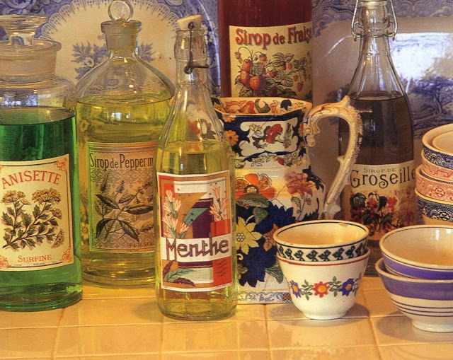
French syrup and liqueur bottles.

Images: French Modern: Art Deco Graphic Design by Steven Heller and Louise Fili, published by Chronicle Books, 1997. Flea Market Style: Decorating with a Creative Edge by Emelie Tolley and Chris Mead, published by Clarkson N. Potter, Inc., 1998.

16 July 2010

Ticking Fabric


Whenever I happen upon scraps of vintage ticking fabric in my travels through flea markets and antique shops, I add them to my stash of goods. To me, striped ticking fabric is the home's equivalent to a great summer dress. Light and airy, it makes a great slipcover to hide away winter fabrics that no one wants to cozy up to when the temperature hits 90˚ and up. I've used it many times in combination with vintage feedbags to create accent pillows or to re-upholster chairs (like the one above). Originally intended as mattress and pillow covering, ticking fabric is sturdy enough to be used in a variety of ways.


A thin hand-buttoned mattress is hung from a curtain rod to create a soft headboard.

A ticking fabric chair is perfectly at home in a beach cottage with bleached furniture and gray drapes.

These blinds add a hint of blue to an elegant white bathroom.

A ticking fabric lampshade is an unusual, but successful, mate to an alabaster lamp.

Not fabric at all, but these painted stones carry the essence of ticking cloth outdoors.

This striped bra as wall-hanging is too cheeky not to include. The chair is casually slipcovered in a variety of blue and white fabrics that can easily be replaced when the temperature drops.

Images: Contemporary Country by Emily Chalmers, photography by Debi Treloar, published by Ryland Peters & Small, 2006. BBC Homes & Antiques Magazine, June 2010 issue. Flea Market Style: Decorating with a Creative Edge by Emelie Tolley and Chris Mead, published by Clarkson N. Potter, Inc., 1998. Marie Claire Idees Magazine, March 2010 issue.

09 July 2010

Shop: Terrain


For pure inspiration, nothing rivals a visit to home and garden hot spot Terrain in Glen Mills, PA. The displays are ever changing and the goods represent the work of talented artisans from around the world. Here are a few photos featuring their vintage furniture, industrial salvage, dishware, lighting and plantings of all kinds--not to mention the greenhouse cafe that has been arranged like a secret garden. 


01 July 2010

Film Interiors: Still Breathing


The first time I saw Still Breathing was in a motel room on one of my cross-country drives. I only caught the last half hour and was intrigued enough to rent the film when I returned home. I consider it a classic in waiting, which is clear from the fact that I have already referenced it in a blog post on cairns (see post for a synopsis of the story). Besides the beautifully written script, atmospheric soundtrack and inviting cinematography of San Antonio, the set decor serves the characters perfectly. Brendan Fraser's character, Fletcher, lives in the Texas house where he grew up. It's a comfortable combination of family heirlooms and his own artistic additions. Rosalyn, played by Joanna Going, is an L.A. con artist who convinces wealthy men to buy expensive art pieces from her friend's gallery. She brings the men to her apartment for the final brush-off, so her place must look like the home of a savvy art lover. It's full of bright color and mod pieces from the fifties.

Fletcher's entryway features framed landscapes, an ornate little mirror and a simple wood lamp.

A vintage clock and tiny wooden boat sit atop cigar boxes.

A well stocked library and the hint of a leather club chair.

Fletcher's grandmother shares some of his childhood relics with a curious Ros.

The covered porch with casual drapes and vintage rattan furniture.

Fletcher's kitchen is grounded by a solid oval table.

Above the sink, a light strip highlights a collection of colorful milkglass coffee cups. Vintage postcards of his city serve as a back splash.

Glass canisters are at home with a large white pitcher and primitive wooden bowl in Fletcher's kitchen.

Rosalyn's dining room is painted sunflower yellow and features a Scandinavian table and chairs and black and white art. It seems to be the least visited room in her apartment. 

Contemporary art purchased for her by a suitor sits temporarily on her desk.

The view from her kitchen: a blue enamel fridge and asymmetrical frames hold paint-by-numbers paintings.

A feminine living room is joined by a heavy tree chunk that serves as her stress-relieving dart board.

The following items from the current marketplace share some of the spirit of the inspiration pieces in Fletcher's home.

A library ladder from Farnsworth on 1stdibs. A clock I currently have for sale at West End Garage. A rococo-style mirror from The Aviary and a leather club chair from Loftgoods.

A teak bench from Cathy's Marketplace and a sewing basket from Timberstoys.

Apothecary jars from Time for Treasures.

Milkglass coffee mugs from Modish Vintage.

And a handful of pieces that are inspired by Rosalyn's digs:

Hans Wegner wishbone chairs from Danish Design Store.

A paint by numbers sailboat painting from Sweet Love Vintage.

A blue fridge from Smeg and a tufted fuchsia sofa from Anne Coyle.

(Film images are the property of Zap Pictures, Inc. and October Films. Production Designer: Denise Pizzini. Set Decorator: Lisa Lopez.)
Related Posts with Thumbnails