26 September 2010

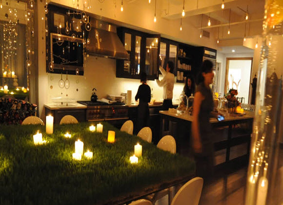
Shop: Rebecca Cole GROWs


This past summer, I was saddened to discover that my favorite NYC spot--Japanese department store Takashimaya--had closed its doors on Fifth Avenue. My primary reason for making it a must-see was its basement restaurant, The Tea Box, which served healthy and affordable lunches. While there, I would check in on the shop's lush garden section for inspiration and unusual ways to bring the outdoors in. Thankfully, a new shop in the fur district looks like it has plenty of great garden and design ideas to share. 

The new destination spot comes courtesy of Rebecca Cole, author of one of my favorite garden books--Paradise Found: Gardening in Unlikely Places. What is special about her work is that she outfits exterior spaces with as much thought as we usually give to indoor rooms and makes sure that indoor spaces are given healthy doses of plant life in unpredictable ways. Rebecca has a full-service design company with an emphasis on implementing green practices without sacrificing style. Her website, Rebecca Cole Design, is full of beautiful images of her shop, rooms and gardens she has designed, and events she has planned. I love seeing outdoor furniture given the Sunday best treatment (notice the tarnished metal bench topped with a row of feminine pillows for an event on the roof of Rockefeller Center).


22 September 2010

Books Arranged by Color


Family and friends know that I have an obsessive compulsive streak, so the fact that I'm attracted to great walls of color-coordinated books is no surprise. Though I've dabbled in arranging my books by color, I've never had a library set-up with all of my books on display in one spot. I still remember driving to south Philly with my friend Liz one evening a few years ago and slowing down so we could get a better look at a red wallpapered library that called to us like a beacon from the third story of an elegant rowhome. A well stocked library will always get a second look from me.

One of the many highlights in Christian Slater's apartment in the movie Bed of Roses is his tidy wall of red and black books and the ladder that he uses to reach them and his rooftop garden (above). Though it takes some effort to achieve, a library that is arranged in blocks of color becomes an artful focal point. And anything that draws people to peruse a library and then curl up with a good book is more than worth the effort.


Images: New Line CinemaHouse & Home magazine, September 2010 issue. Thrifty Chic: Interior Style on a Shoestring by Liz Bauwens and Alexandra Campbell, photography by Simon Brown, published by CICO Books 2009. Living etc magazine, May 2010 and June 2010 issues.

13 September 2010

Wallpaper


For the past year, I've been driving back and forth to Cape May to tend to my shop space at West End Garage. On my way home a few weeks ago, I noticed this amazing exposed interior wall next to a vacant lot on Vine Street in Philadelphia. I only just got around to photographing it this weekend, though sadly the sun had already set by the time I got to it.  What amazes me is that one home could have featured so many bold patterns and that a couple of them are just old enough to be current again (the blue chandelier print on the first floor is my favorite).


I think wallpaper has gotten a bad rap for the last couple of decades because so many of us have suffered through the process of removing the stuff and don't ever want to experience it again. In the past, people wallpapered every exposed surface in their home, often including closets and the inside of kitchen cabinets. The result was a visual assault that many have fought against by leaning toward the opposite extreme--all white or all beige walls. Ever since I discovered Neisha Crosland's gorgeous designs, I've warmed to the idea of papering one wall in a space or adding it to a half wall of tile in a bathroom. I wasn't a huge fan of the movie Kate & Leopold, but I'll watch it whenever it comes on cable just so I can catch sight of Meg Ryan's wallpapered bathroom (see Hooked on Houses for images). One of these days, I fully intend to paper a room--though I'll probably go with the new generation of papers that don't require pasting and can be removed and re-attached in another space.


Images: Simple Style by Julia Bird with text by Bridget Bodoano, photography by Hotze Eisma; published by Friedman/Fairfax 2003. Thrifty Chic by Liz Bauwens and Alexandra Campbell, photography by Simon Brown; published by CICO Books 2009. Living etc magazine, September 2010 issue. Inside Out magazine, March-April 2009 issue and June 2004 issue. Country Homes & Interiors magazine, June 2010 issue. Red magazine, July 2010 issue. Living etc magazine, August 2009 issue. Country Living magazine, September 2010 issue.

09 September 2010

Foyers


Perhaps because I've lived in so many cold and rainy climates, I've always appreciated foyers as rooms of their own--even when they're really nothing more than a glorified hallway. Now that the trees on my street are shedding at a surprising rate and the temperature is showing signs of dropping, my appreciation for these little spaces is renewed. They are the home's place of greeting, the first point of respite from harsh weather conditions outdoors, and a place to drop keys and kick off heavy boots. I think it's a shame that so much new construction relegates these spaces to the back of the house and renames them "mudrooms". When foyers are treated as rooms worthy of good furniture and a few choice accessories, their charm is increased by the disarray that stray coats and shoes invite. 


Images: The Comforts of Home by Caroline Clifton-Mogg, published by Ryland, Peters & Small 2010. Country Living magazine, October 2010 issue. BBC Homes & Antiques magazine, June 2010 issue. Living etc magazine, August 2010 issue. Inside Out magazine, volume 3.
Related Posts with Thumbnails